Senior Portraits — What Not to Wear for Timeless, Elevated Images in Lancaster, PA
Senior portraits are one of the most meaningful investments you’ll make during your high school years. They capture not only how you look, but who you are in this once-in-a-lifetime season. And while location, lighting, and posing all play an important role, what you wear is one of the most influential factors in how your final images feel and stand the test of time.
The truth is, certain wardrobe choices can pull attention away from your face, compete with your surroundings, or quickly date your images. And because senior portraits are meant to last for decades—not just for today—these decisions matter more than most people realize.
The goal isn’t perfection—it’s intention. When your wardrobe is thoughtfully chosen, it enhances your features, complements your setting, and allows your personality to shine through effortlessly. When it’s not, it can shift the focus away from what truly matters: you.
In this guide, I’ll walk you through exactly what not to wear for your senior session, so your images remain classic, elevated, and beautiful for years to come. And if you’re looking for guidance on what does work beautifully, be sure to explore Choosing Wardrobe Colors for Lancaster Senior Portraits for complementary styling advice.
Avoid Large Logos and Graphic Branding
Clothing with large logos or bold branding can quickly overpower an image. While it might feel natural to wear your favorite brand or something you wear every day, these elements tend to draw attention away from your face and expression—the most important part of any portrait.
Logos also introduce a commercial feel to your images. Instead of capturing a meaningful milestone, the focus can unintentionally shift toward the brand itself. Over time, logos can also date your photos. What feels current now may look outdated in just a few short years, which takes away from the timeless quality most families are hoping to achieve.
I’ve seen sessions where everything else was perfect—the lighting, the location, the expression—but a bold logo became the first thing your eye noticed in every image. It’s a small detail that can make a big impact.
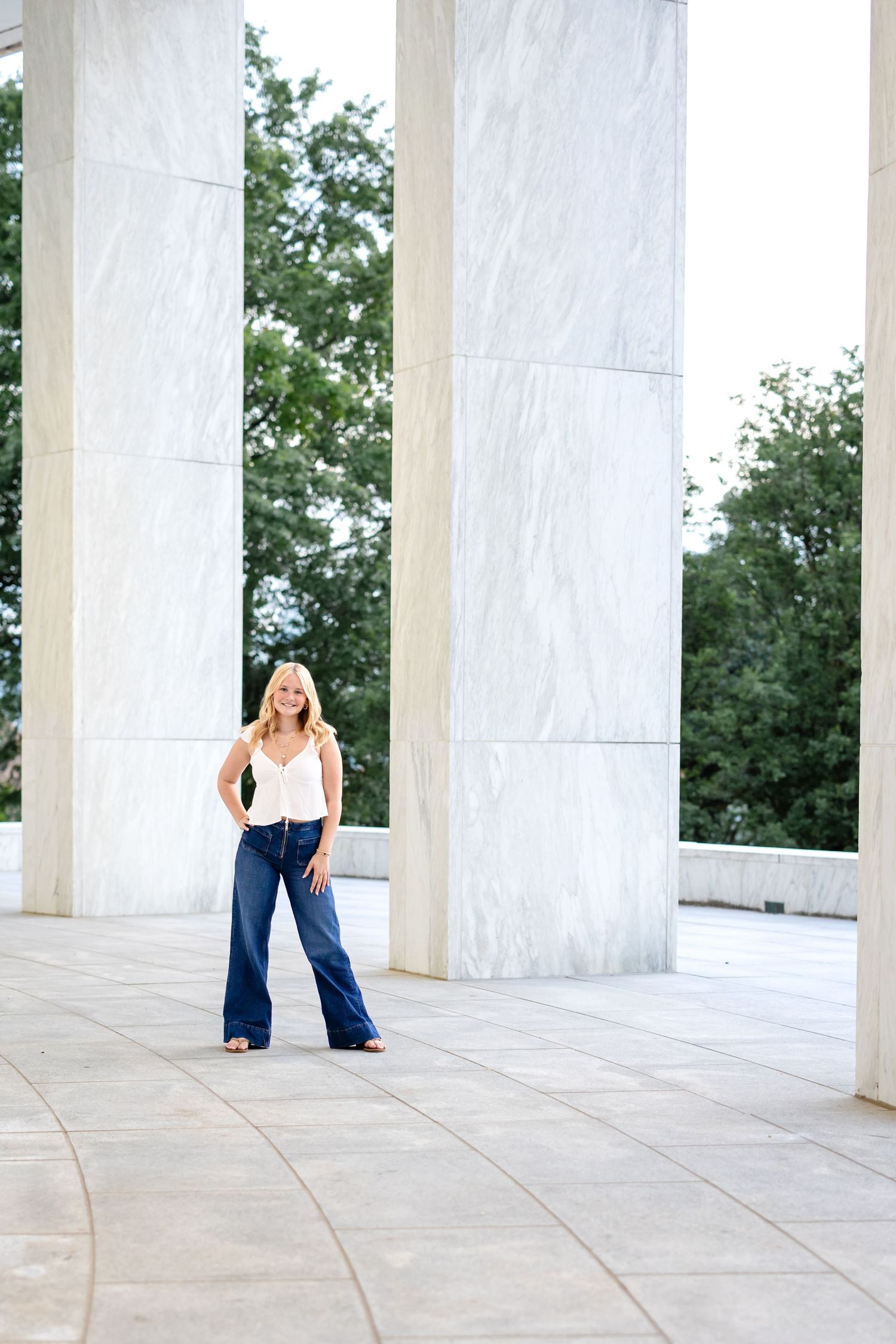
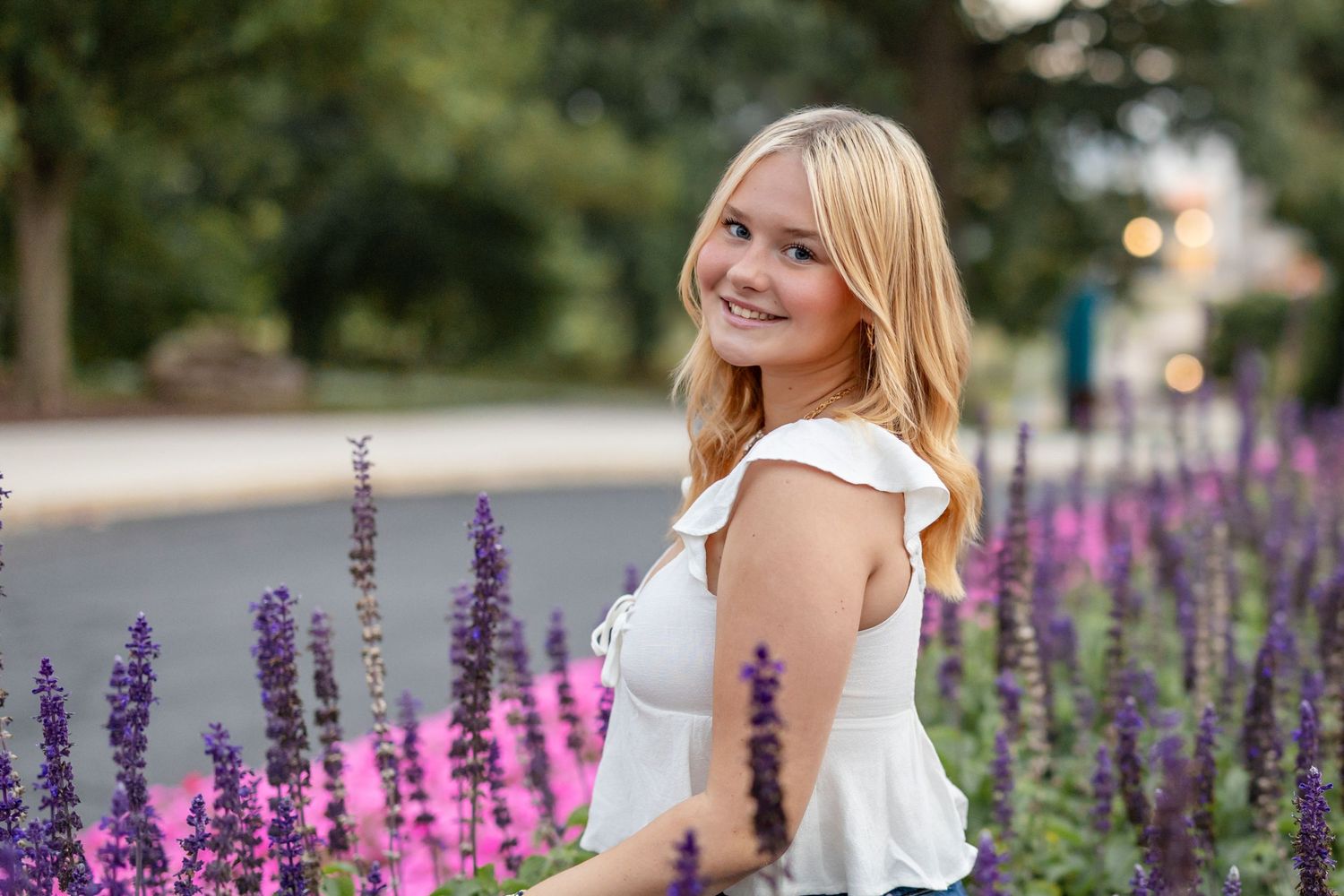
Instead, opt for clean, classic pieces. Solid colors, subtle textures, and well-tailored clothing will always photograph more beautifully. These choices allow your personality, confidence, and natural expression to take center stage.
Be Careful with Red and Color Casting
Red is a striking and confident color, but in photography, it needs to be used thoughtfully. Certain shades—especially bright or highly saturated reds—can reflect onto the skin, creating what’s known as a color cast. This can subtly shift skin tones, making them appear warmer or uneven in ways that are difficult to fully correct in editing.
This becomes especially noticeable in close-up portraits, where natural skin tone is essential for a polished, professional result.
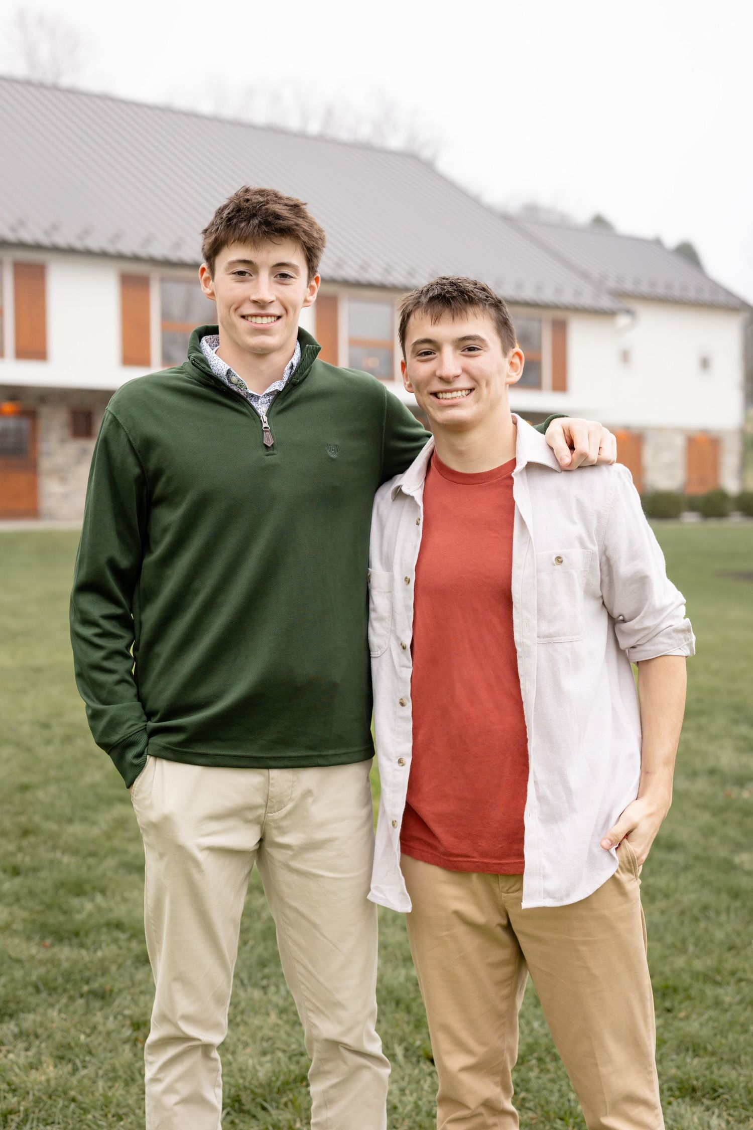
That said, red isn’t completely off-limits. Deeper, muted tones—like burgundy or soft rust—can photograph beautifully when styled correctly. The key is choosing shades that enhance your natural coloring rather than compete with it.
This is one of the reasons professional guidance matters so much. Understanding how color interacts with light, skin tone, and environment allows for wardrobe choices that feel intentional and refined rather than unpredictable.
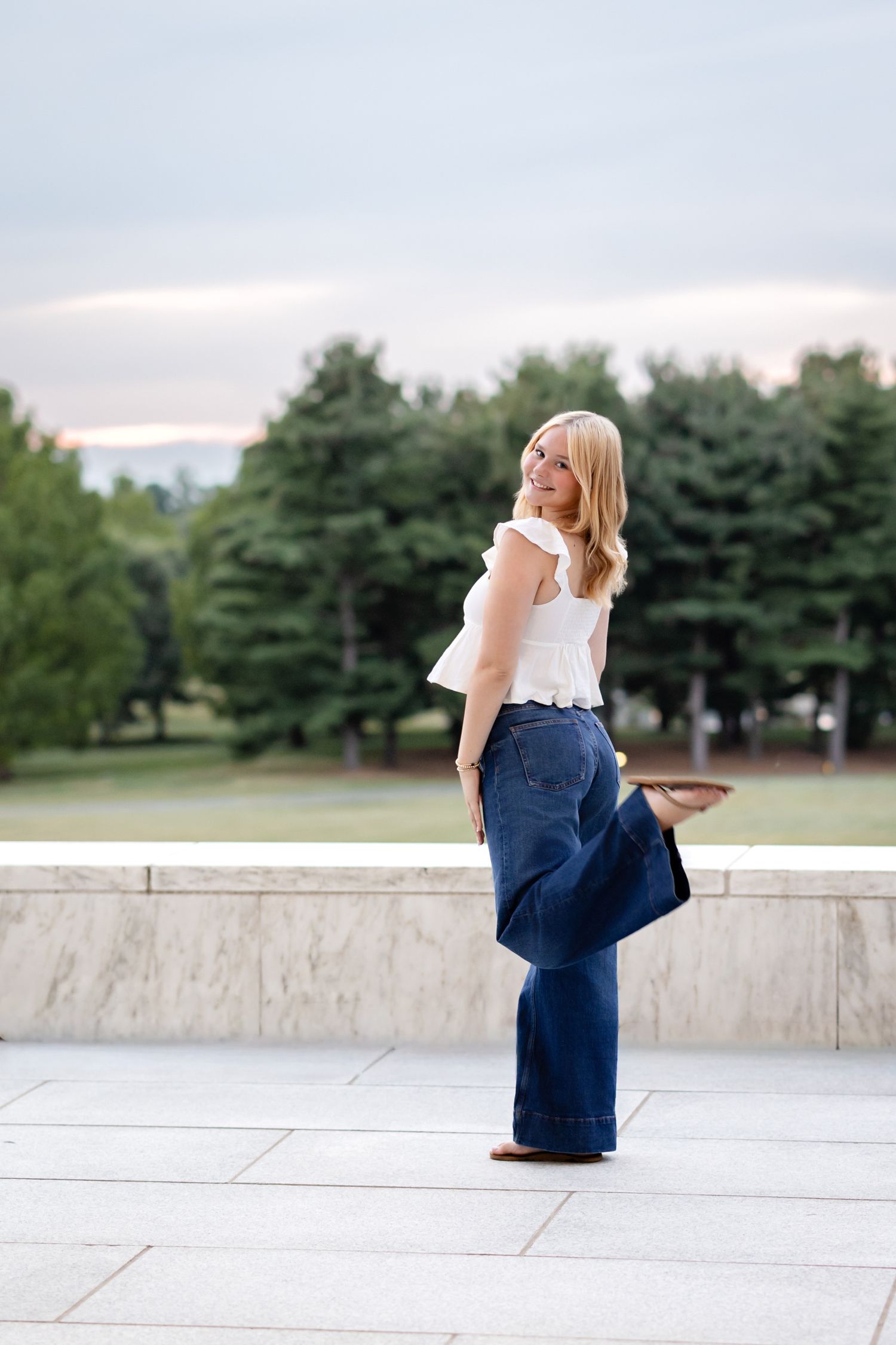
Greens, Camouflage, and Neon Colors
Green is a beautiful color, but it can be tricky—especially in outdoor settings like those found throughout Lancaster County. When the background already includes lush greenery, certain shades of green can cause you to blend into your surroundings, reducing contrast and making your images feel flat.
Camouflage patterns take this even further, often making it difficult to distinguish your shape and drawing attention away from your face.
Neon colors present a different challenge. These highly saturated tones tend to reflect light in unnatural ways, often casting bright hues onto the skin and creating an overly intense look. While they may feel fun or bold in person, they rarely translate well in professional portraits.
A more elevated approach is to select tones that complement the environment rather than compete with it. Soft neutrals, warm earth tones, and muted hues create a cohesive, polished look that enhances both you and the setting.
Stripes, Busy Patterns, and Visual Distractions
Patterns can add interest to an outfit—but they must be chosen carefully. Tight stripes, in particular, can create a moiré effect, a visual distortion that occurs when the camera sensor struggles to process repeating patterns. This results in a distracting, almost wavy appearance that cannot always be fixed in post-processing.
Beyond technical concerns, busy patterns in general can overwhelm an image. When there’s too much happening visually, the viewer’s eye doesn’t know where to focus. Instead of being drawn to your expression, attention is pulled toward the clothing itself.
Subtle patterns can work beautifully when styled well, but simplicity tends to create the most timeless results. Clean lines, soft textures, and understated details allow your images to feel elevated, cohesive, and effortless.
Accessories, Trends, and Athletic Wear to Avoid
Accessories should enhance your overall look—not dominate it. Large, flashy, or overly bold jewelry can quickly become distracting, especially when it catches light or competes with your facial features. The goal is always balance.
Trends are another important consideration. Items like smart watches, ultra-trendy pieces, or anything tied closely to current fashion cycles can make your images feel dated sooner than expected. Senior portraits are meant to feel timeless, so leaning into classic, enduring styles is always the best choice.
Athletic wear is also something to avoid. This includes moisture-wicking polos, gym-style outfits, and performance fabrics. While comfortable, these materials often lack structure and don’t photograph with the same level of refinement as more tailored clothing.
Footwear is just as important. Crocs, casual sneakers, clogs, and visible white socks can take away from an otherwise polished look. Even though these details may seem small, they can significantly impact the overall feel of your images.
If you want to feel fully prepared and confident going into your session, I highly recommend reviewing Senior Portraits — What Not to Do to help you avoid common challenges.
The Importance of Expert Guidance
Choosing what to wear for your senior portraits can feel overwhelming—but this is where working with an experienced photographer makes all the difference. A professional understands how colors, textures, and styling translate on camera and will guide you every step of the way.
In my process, I provide a comprehensive style guide along with personalized, one-on-one support. Together, we refine your wardrobe choices, coordinate multiple outfits, and ensure everything aligns beautifully with your session locations and overall vision. You’ll never be left guessing—you’ll feel confident and fully prepared.
Wardrobe is not just a detail—it’s a foundational part of your session. The right choices elevate everything, from how you feel in front of the camera to how your final images come together as a cohesive, timeless collection.
Begin Your Senior Portrait Experience in Lancaster, PA
Your senior session should feel exciting, effortless, and truly reflective of who you are in this moment. And when every detail is thoughtfully planned, it allows you to relax, enjoy the experience, and step confidently into the spotlight.
If you’re ready to create senior portraits that feel elevated, natural, and uniquely you, let’s connect. I would love to help you plan every detail—from wardrobe to final artwork—so your images are not only beautiful today, but treasured for years to come.