Choosing Colors That Photograph Beautifully in Every Season for Senior Portraits
Color plays a powerful role in how your senior portraits look, feel, and live on long after your session. From the moment your gallery is revealed to the way your images are displayed in your home, the colors you wear influence everything. They affect how your skin tone is rendered, how cohesive your gallery feels, and how timeless your portraits will appear years from now.
When thoughtfully chosen, color brings harmony to your session. It elevates your images, enhances natural light, and ensures your portraits feel refined and intentional. Whether you’re envisioning heirloom albums, framed wall art, or graduation announcements, selecting the right color palette is one of the most important steps in creating a luxury senior portrait experience.
Why Color Matters More Than You Think
Every detail in your session contributes to the final result—but color is one of the most visually impactful elements. It sets the tone, creates mood, and guides the viewer’s eye. Soft, neutral tones feel timeless and elegant, while richer hues can add depth and personality.
The right colors also ensure your gallery feels cohesive. When your outfits complement each other and the environment, your final images flow beautifully from one to the next. This is especially important when designing albums or displaying multiple images together in your home.
Choosing colors isn’t about following strict rules—it’s about creating a look that feels elevated, natural, and uniquely you.
Blues: A Timeless Favorite
Blue is one of the most universally flattering colors for senior portraits—and for good reason. It complements nearly every skin tone, photographs beautifully in natural light, and feels both classic and modern at the same time.
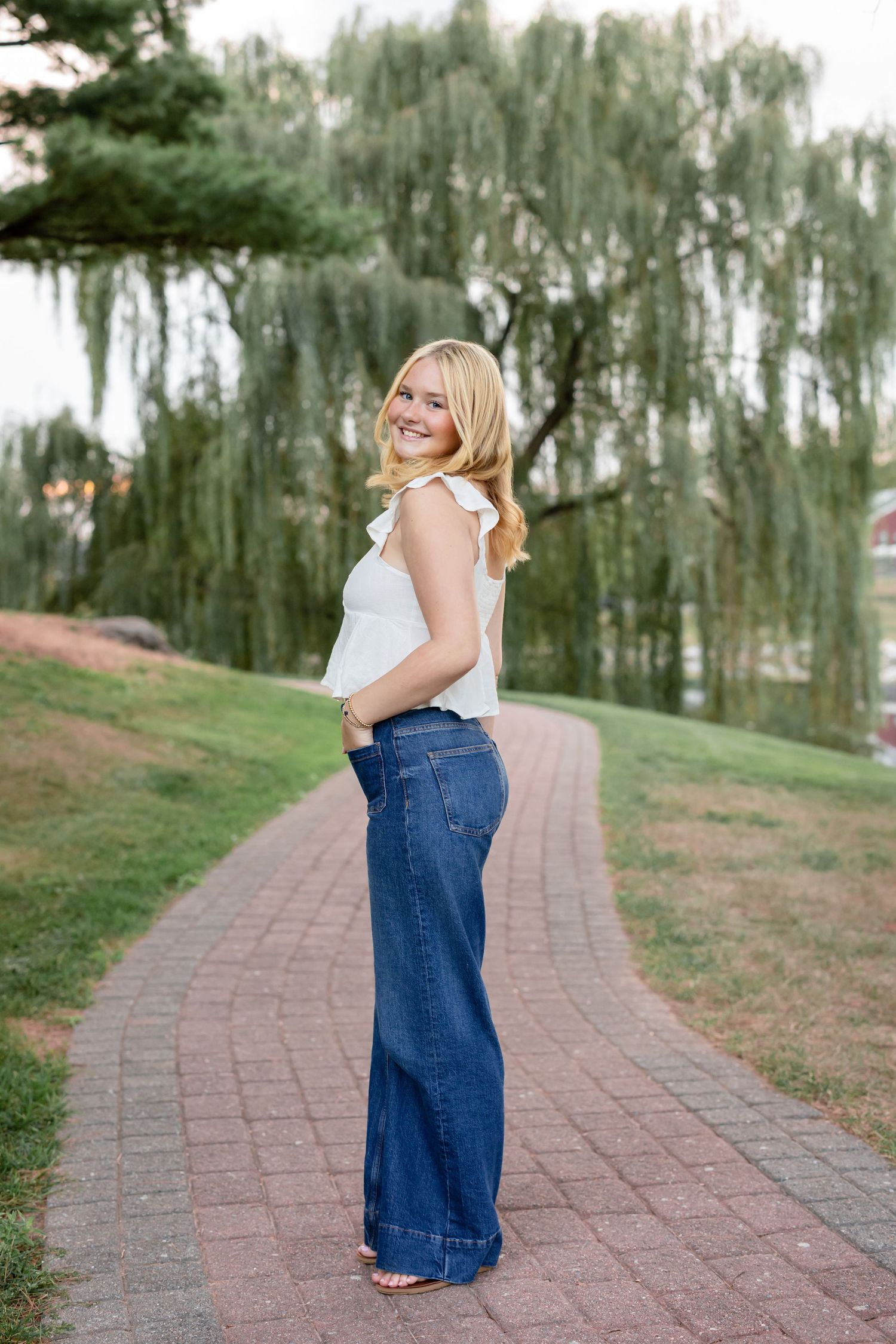
For girls, soft dusty blues or deeper navy tones create a refined, elegant look. For guys, blue is a go-to choice that feels polished without being overly formal. A crisp blue button-down or a layered look with denim can photograph effortlessly well.
Blue also pairs beautifully with outdoor settings, especially in Lancaster’s natural landscapes. Whether against greenery, open fields, or golden hour light, it remains a reliable and stunning choice.
Neutrals: The Foundation of a Luxury Look
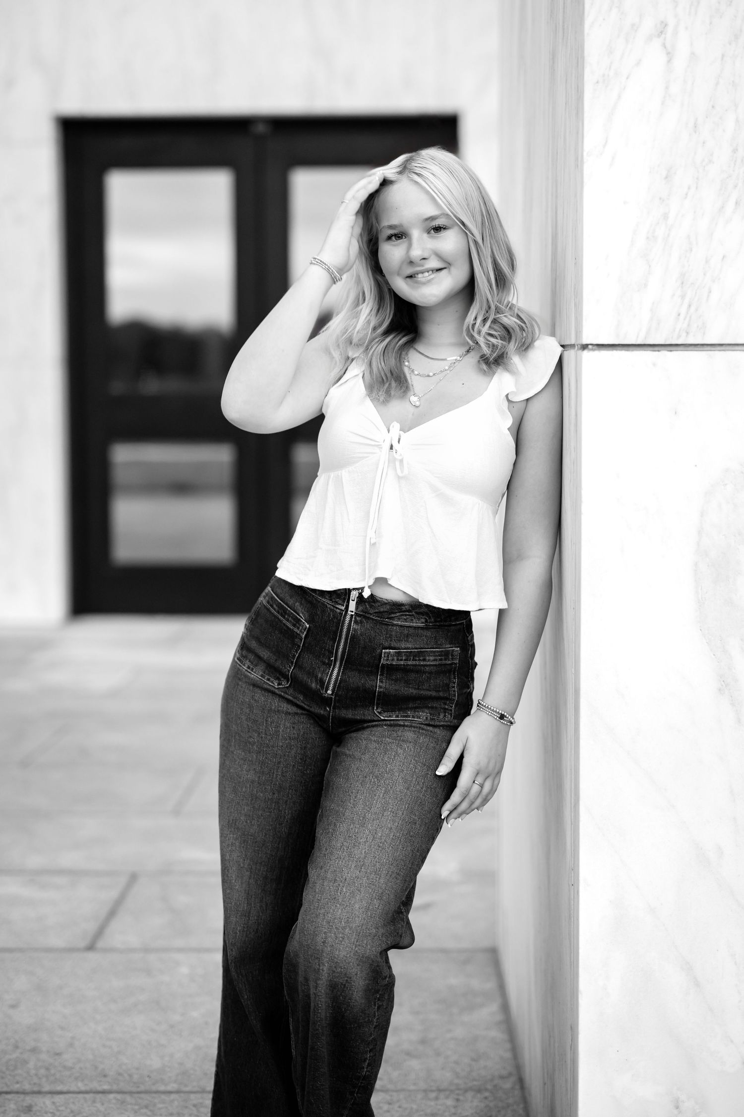
If there’s one recommendation every senior should follow, it’s to include at least one neutral outfit. Shades like white, cream, beige, and soft taupe are timeless, flattering, and effortlessly elevated.
Neutrals allow the focus to remain on you—your expression, your personality, your presence—rather than competing for attention. They also reflect light beautifully, creating a soft, luminous effect that enhances skin tones.
These tones are especially stunning in heirloom products. Whether printed in an album or displayed as wall art, neutral palettes ensure your images will never feel dated. They are, without question, a cornerstone of a refined senior portrait wardrobe.
Pinks & Warm Tones: Soft to Statement
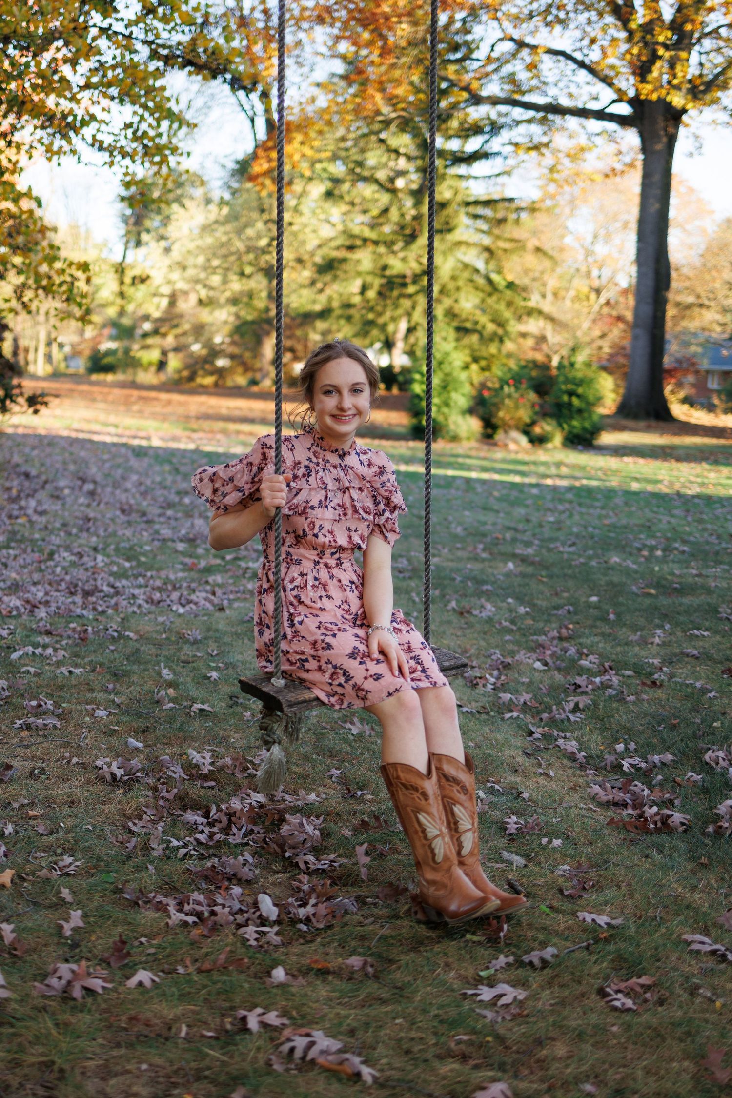
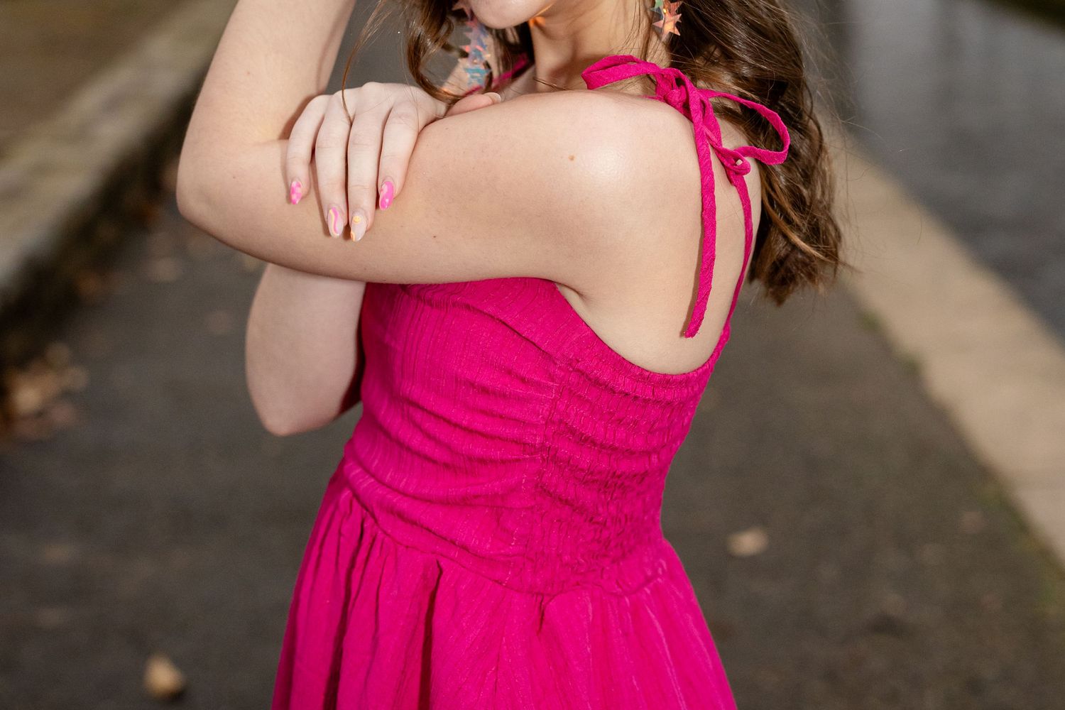
Pink is a favorite among many senior girls, and it offers a beautiful range of possibilities. Soft blush tones feel romantic and delicate, while brighter pinks can add energy and personality to your gallery. Both photograph beautifully when styled thoughtfully.
For senior guys, warmer tones like salmon or muted red offer a subtle way to incorporate color while still maintaining a masculine, polished look. These shades pair especially well with khaki or light neutral bottoms, creating a balanced and cohesive outfit.
The key with pinks and warm tones is choosing shades that complement your skin tone and avoiding anything overly saturated that might overpower your features.
Bright Colors: How to Use Them Well
Bright colors can absolutely have a place in your senior session—but they should be used intentionally. When styled correctly, bold colors can add vibrancy and contrast, making certain images stand out in your gallery.
The key is balance. Pairing a bright top with neutral bottoms, or incorporating bold tones through accessories, allows you to enjoy color without overwhelming the image.
It’s important to approach certain shades with caution. Neon colors tend to reflect onto the skin, creating unnatural color casts that are difficult to correct. Similarly, very strong reds can sometimes reflect onto the face, especially in bright light.
With thoughtful styling and guidance, bright colors can elevate your session while still maintaining a polished, cohesive look.
Coordinating Colors for Friends Sessions
If you’re planning a friends session, color coordination becomes even more important. The goal isn’t to match exactly—but to create a harmonious palette that looks intentional and elevated when photographed together.
Choosing a general color scheme—such as neutrals with soft pastels, or denim paired with warm tones—helps ensure everyone complements one another without looking overly styled. Communication is key here, and knowing what each person plans to wear allows for a cohesive final gallery.
Creating a Legacy Through Color
The colors you choose don’t just impact your session—they shape how your images will live on. From heirloom albums to framed wall art and matted fine art prints, your color palette plays a significant role in the final presentation.
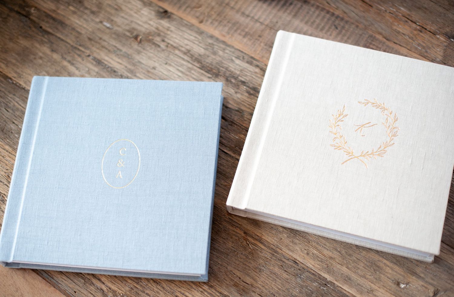
An heirloom album is the most loved way for seniors to preserve their images. It tells the story of your session in a cohesive, tangible way—one that can be shared with family and treasured for generations. It also makes a meaningful and lasting graduation gift. When your colors are thoughtfully chosen, your album feels elevated, timeless, and beautifully curated from beginning to end.
Planning Your Session with Confidence
Choosing what to wear doesn’t have to feel overwhelming. With the right guidance, your wardrobe can come together in a way that feels effortless and refined. From personalized styling advice to curated recommendations, every detail is designed to support a seamless and enjoyable experience.
If you’re still in the early stages of planning, choosing the right photographer can help ensure you’re working with someone who will guide you through every step—from wardrobe to final artwork.
When you feel confident in your choices, it shows. And that confidence is what truly makes your images shine.
Begin Planning Your Senior Portrait Experience
Your senior portraits should feel like a reflection of who you are—elevated, intentional, and uniquely yours. Choosing the right colors is just one step in creating a gallery that feels cohesive, timeless, and meaningful.
When you’re ready to begin planning, I would love to connect and explore your vision, answer all of your questions, and reserve your session when the time feels right—creating an experience that is beautifully tailored to you.
Related: