Coordinating Wardrobe Colors for Families: A Guide to Elegant, Cohesive Portraits
Selecting what to wear for family portraits is often one of the most meaningful—and sometimes overwhelming—parts of the planning process. Clothing does far more than simply dress your family; it sets the tone for your entire session, influences how your images feel, and plays a significant role in how timeless your portraits will appear years from now. When thoughtfully coordinated, wardrobe becomes an extension of your family’s story, enhancing connection, movement, and emotion without distracting from the people within the frame.
For many families, the question is not simply what looks good individually, but how each piece works together to create a cohesive, harmonious look. This is where intentional color coordination becomes essential. Rather than matching outfits exactly, modern family portrait styling focuses on blending tones, textures, and subtle variations to achieve a refined, editorial aesthetic that feels both natural and elevated.
When approached with care, wardrobe coordination transforms your images into something truly special—portraits that feel curated yet effortless, polished yet deeply personal. By understanding how colors interact, how patterns should be balanced, and how seasonal tones influence the overall mood, families can create a look that enhances every aspect of their session.
Building Your Color Palette
The foundation of any well-coordinated wardrobe begins with a thoughtfully chosen color palette. Rather than selecting outfits individually, start by envisioning the overall look you want your images to have. Soft, romantic tones create a light and airy feel, while deeper, richer colors evoke warmth and depth.
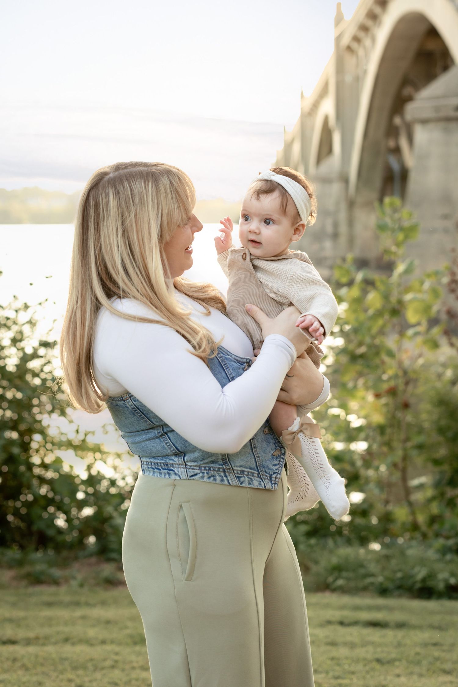
Some of my personal favorite palettes include blush tones and dusty light blues, which photograph beautifully in a variety of settings. These colors are soft, flattering, and timeless, offering just enough visual interest without overwhelming the image. They pair effortlessly with neutrals and work especially well in natural light, creating a cohesive and elegant aesthetic.
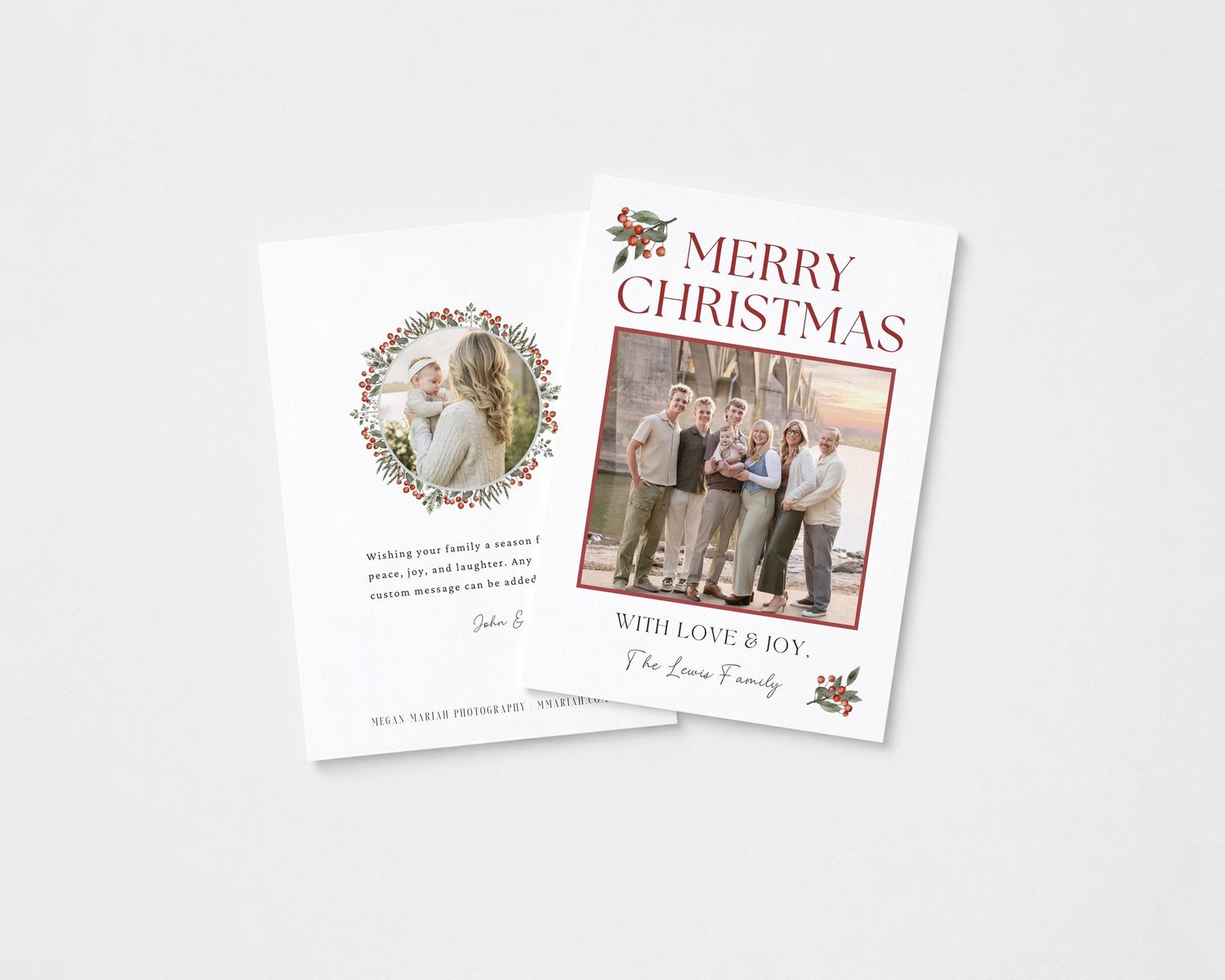
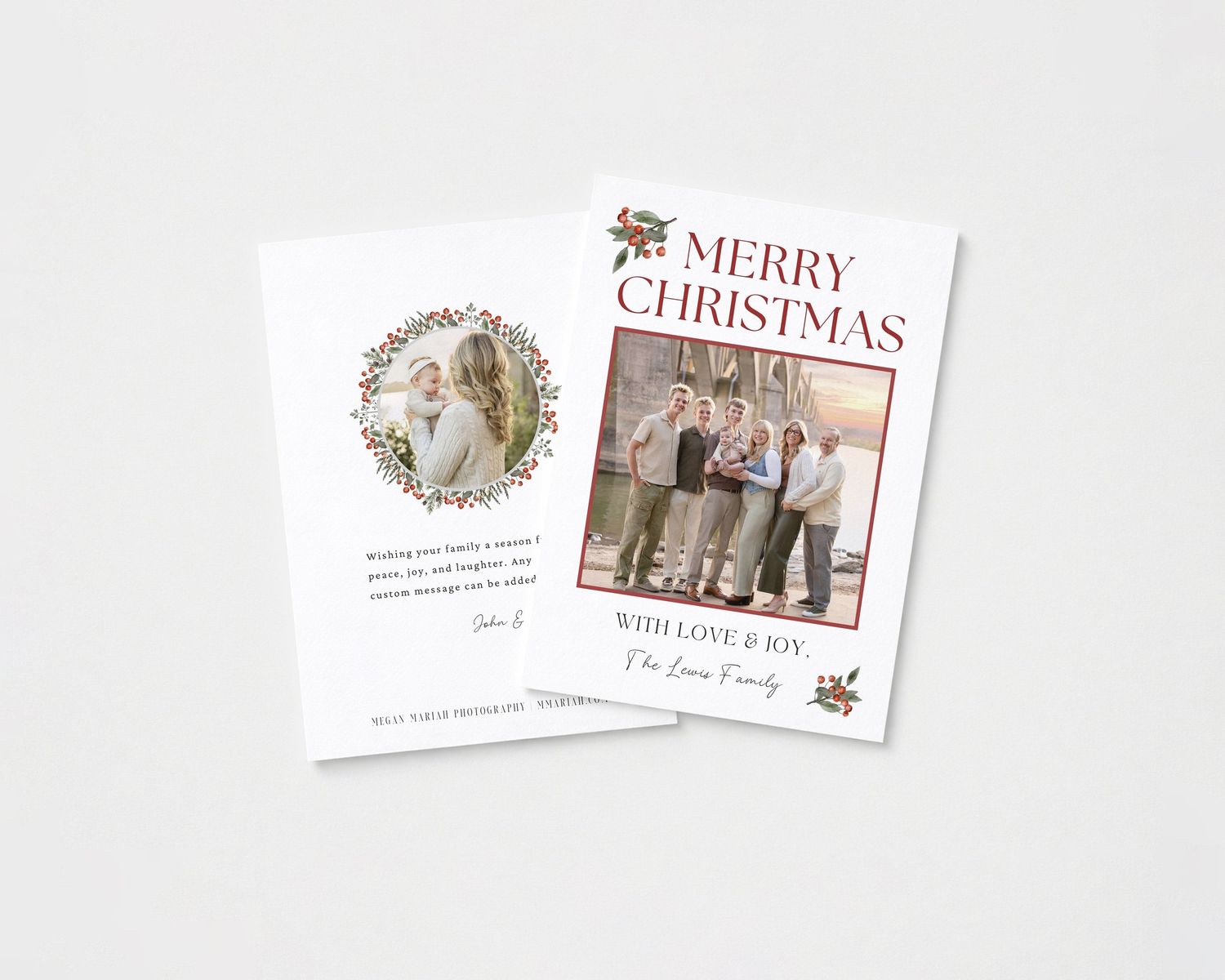
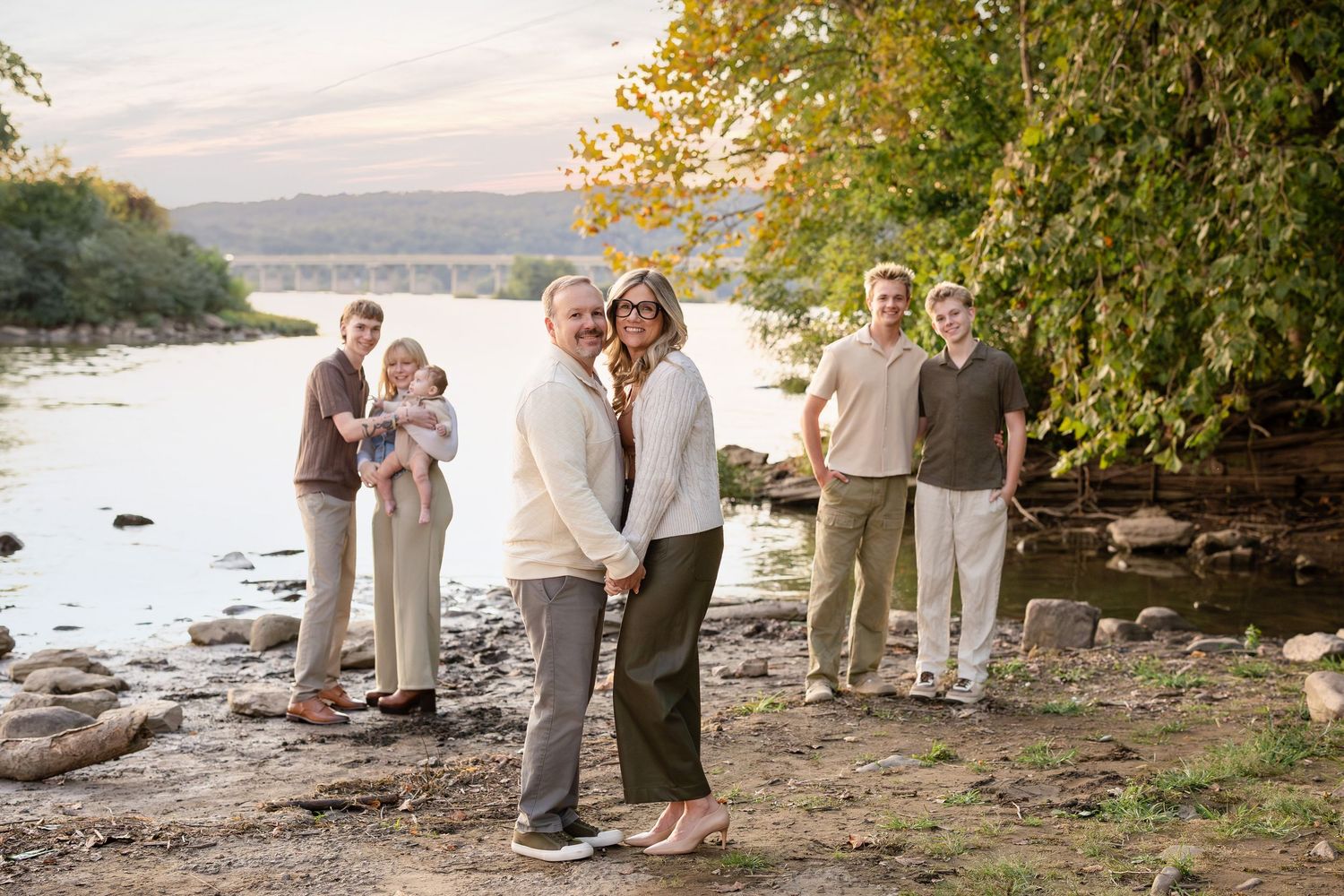
Neutral palettes are another excellent choice, particularly for families seeking a classic and refined look. Shades of cream, ivory, taupe, soft gray, and muted beige allow the focus to remain on connection and expression. These tones are versatile and enduring, ensuring your portraits will feel just as beautiful years from now as they do today.
When building your palette, aim for three to four complementary colors that can be distributed throughout the family. This approach provides enough variation to keep the image visually interesting while maintaining harmony and balance.
Styling One Person First
One of the most effective ways to simplify wardrobe coordination is to begin with one key outfit, typically for mom or the individual whose look will anchor the session. This outfit becomes the foundation upon which all other choices are built.
Select this piece with care, considering not only color but also texture, movement, and overall style. A flowing dress, a soft knit, or a structured yet elegant outfit can set the tone for the entire family. Once this look is established, coordinate the remaining outfits around it by pulling complementary tones and textures from the same palette.
This method ensures cohesion without forcing uniformity. Each family member can express their individuality while still contributing to a unified visual story. The result is a collection of images that feel intentional, elevated, and beautifully balanced.
Seasonal Color Considerations
The time of year plays a significant role in how colors appear on camera and interact with the surrounding environment. Choosing tones that complement the season ensures your images feel harmonious and visually complete.
In spring and summer, lighter palettes shine. Soft pastels, airy neutrals, and gentle pops of color bring freshness and vibrancy to your portraits. Blush tones, light blues, soft greens, and hints of warm peach or lavender can add dimension while maintaining an elegant, cohesive feel.
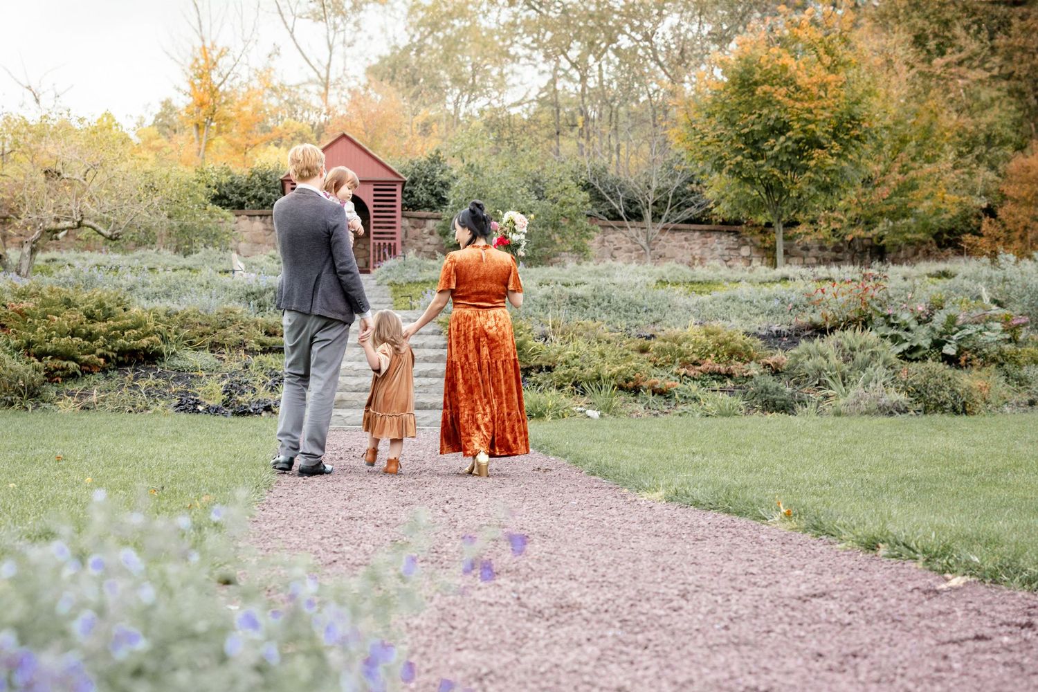
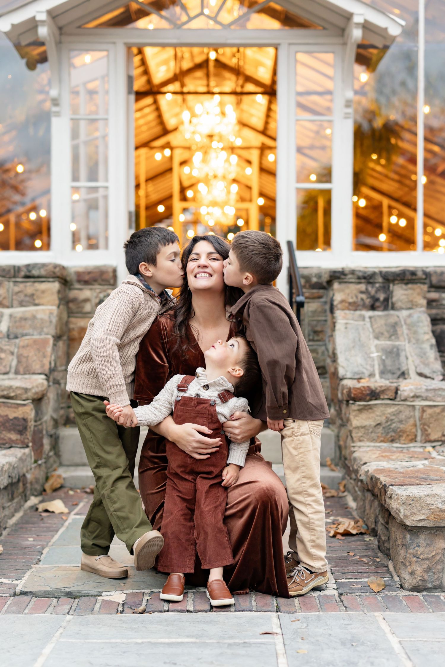
In fall, richer hues take center stage. Jewel tones such as deep burgundy, emerald green, navy, and mustard create warmth and contrast beautifully against autumn landscapes. These colors add depth and sophistication, enhancing the natural richness of the season without overpowering your family’s connection. By aligning your wardrobe with the season, your images will feel grounded in their environment while maintaining a timeless quality.
Balancing Patterns and Textures
Patterns can add interest and personality to your portraits, but they must be used thoughtfully to avoid visual distraction. A good rule of thumb is to limit patterns and balance them carefully within the group.
If more than one person wears a pattern, ensure they do not compete with one another. For example, one individual might wear a small, subtle pattern, while another incorporates a larger, more spaced-out design. Keeping patterns within the same color palette ensures they complement rather than clash.
Texture is equally important and often underutilized. Fabrics such as knits, linen, chiffon, denim, or soft cotton add dimension without overwhelming the image. Layering textures creates depth and visual interest while maintaining a refined, cohesive look.
When done well, the combination of subtle patterns and varied textures enhances your portraits, adding richness and complexity while keeping the focus on your family.
Avoiding Common Wardrobe Pitfalls
While there are many ways to achieve a beautiful, cohesive look, there are also a few common pitfalls to avoid. Bright neon colors, overly bold prints, and heavily branded clothing can distract from the emotional connection within the image. These elements tend to draw the eye away from faces and interactions, which should always remain the focal point.
Matching outfits exactly—such as everyone wearing identical white shirts and jeans—can feel outdated and lacks the depth that modern portrait styling embraces. Instead, aim for coordination rather than uniformity, allowing each outfit to contribute to the overall aesthetic without appearing repetitive.
It’s also important to consider fit and comfort. Clothing that feels restrictive or uncomfortable can affect posture and confidence, especially for children. Choosing pieces that allow for movement ensures your family can interact naturally, resulting in more authentic and relaxed images.
Finalizing Your Wardrobe
Once you have selected your outfits, take time to review them together as a complete collection. Lay everything out side by side to ensure the colors, textures, and patterns work harmoniously. This step often reveals small adjustments that can elevate the overall look, such as swapping out an accessory or softening a color choice.
Communication is key. Make sure everyone understands the plan and has their outfits prepared well in advance to avoid last-minute stress. If your photographer offers guidance or styling support, take advantage of their expertise—they can provide valuable insight into how your wardrobe will translate on camera.
For inspiration on how your coordinated wardrobe comes to life during the session, explore Fun Prompts for Family Groups. And when your images are complete, learn how to preserve them beautifully in Creating Heirloom Albums for Families.
Creating a Cohesive and Timeless Look
Ultimately, wardrobe coordination is about more than just clothing—it is about creating a visual story that reflects your family’s connection, personality, and style. When colors are thoughtfully chosen, patterns are balanced, and textures are layered with intention, the result is a gallery of images that feels both elevated and authentic.
By starting with a clear palette, styling one person first, and aligning your choices with the season and setting, you can approach your session with confidence and clarity. The process becomes not just manageable, but enjoyable—a creative opportunity to design a look that enhances every moment captured.
Reserve Your Family Portrait Session
Connecting with me is the first step toward creating a seamless and elevated portrait experience. I would love to understand your vision and answer any questions you may have, guiding you through wardrobe coordination, location selection, and every detail in between. Together, we will create timeless, elegant images that reflect your family beautifully and authentically.