Best Colors to Wear for Family Portraits | Styling Guide for Timeless Family Photography Lancaster PA
Why Color Choice Matters More Than Most Families Realize
Choosing the best colors for family portraits is one of the most influential styling decisions you will make when planning your session, yet it is often the most underestimated. Long before posing, location, or even lighting is considered, color is what immediately shapes the emotional tone of an image. It determines whether a portrait feels soft and cohesive or visually distracting, whether it feels timeless or trend-driven, whether it blends beautifully into a home or feels disconnected from it.
When families look back on their images years later, they may not remember the exact shade of a dress or shirt, but they will absolutely feel the impact of how everything came together visually. Color is what ties people together in a frame, what connects subjects to their environment, and what ultimately influences how the image lives beyond the session itself—especially when displayed as wall art in a home.
This is why professional photographers spend so much time guiding wardrobe decisions. It is not about rigid rules or limiting creativity, but about helping families understand how color behaves in natural light, how it interacts with outdoor environments in Lancaster, and how it contributes to the overall storytelling of a portrait. When chosen intentionally, color becomes one of the most powerful tools for creating imagery that feels elevated, cohesive, and timeless.
One of the simplest ways to begin narrowing down your wardrobe choices is to think in terms of refined, proven color families that consistently photograph beautifully in natural light. Rather than focusing on exact matching, it helps to build a soft palette that feels intentional yet organic, allowing each family member to contribute to a cohesive visual story.
Some of the most timeless and flattering choices include:
- Neutral palette: beige, ivory, cream, taupe, soft tan, and warm sand tones
These tones create a clean, airy foundation that allows connection and expression to remain the focal point without visual distraction.
- Earth tones: warm browns, muted olive, soft sage, dusty greens, and layered neutrals
These colors feel grounded and organic, blending beautifully with Lancaster’s natural landscapes while still offering depth and richness.
- Soft accent tones: muted blushes, dusty rose, and soft blues
These shades add gentle warmth and subtle contrast without overpowering the frame, making them especially flattering for both skin
tones and natural light settings.
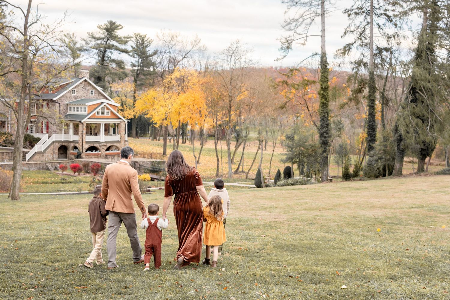
- Seasonal depth tones: jewel tones for fall such as deep emerald, muted sapphire, and rich plum, along with seasonal favorites like rust, burgundy, and warm cinnamon
These tones work especially well in autumn sessions when the environment already carries warmth and saturation, helping create a
layered, painterly feel.
Each of these color families can be used individually or blended thoughtfully across a family wardrobe, depending on the look and emotional tone you want to achieve. The key is not perfection or uniformity, but harmony—allowing subtle variation while maintaining a cohesive overall palette that feels natural in both the environment and the final gallery.
Building a Timeless Color Palette for Family Portraits
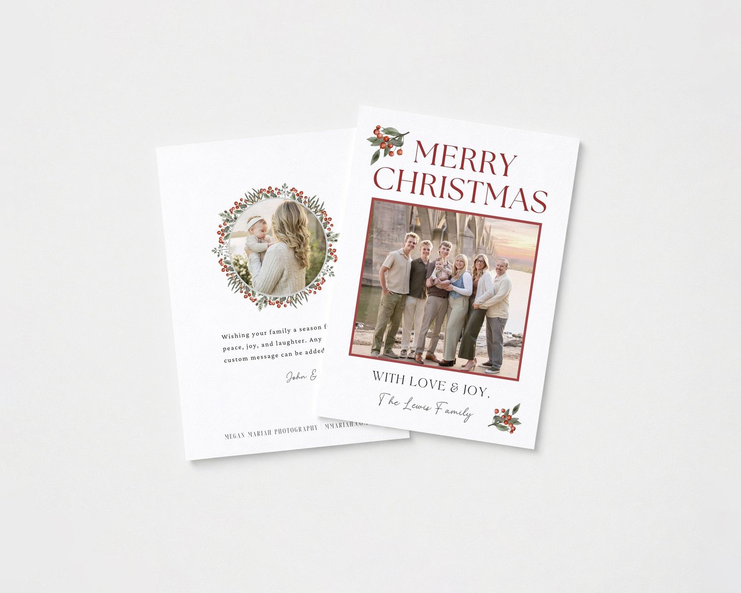
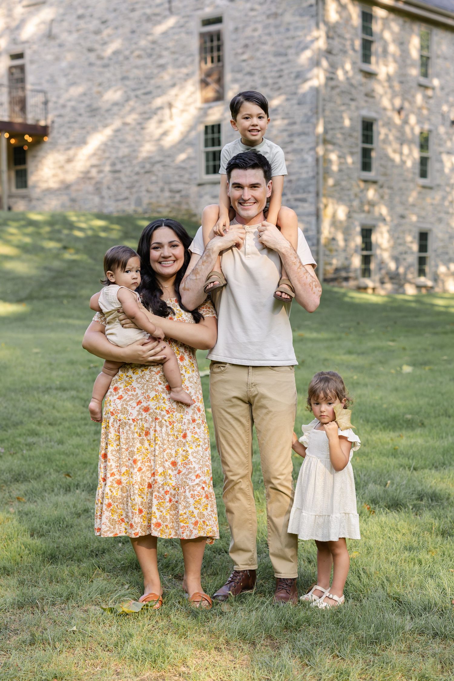
A timeless family portrait wardrobe begins with a foundation of soft, natural tones that complement rather than compete with the environment. Neutrals such as cream, ivory, warm beige, soft taupe, and muted browns create a calm visual base that allows emotion and connection to remain the focus of the image. These tones photograph beautifully in almost any season and provide a sense of continuity across different family members without feeling overly matched.
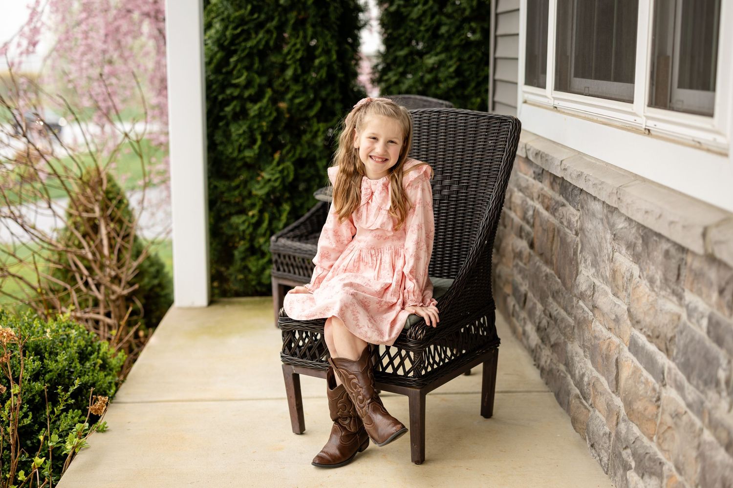
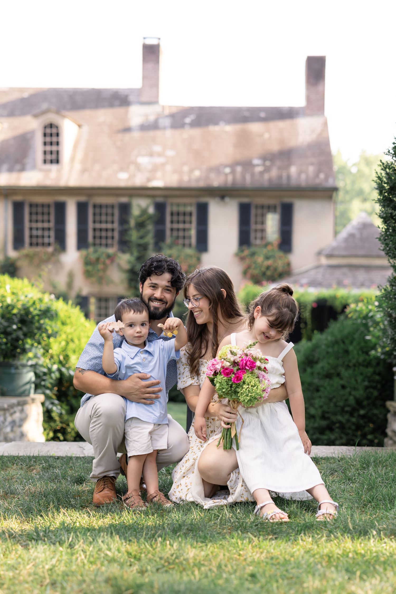
From there, adding subtle accent tones can bring depth and personality into the palette. Soft blues, dusty blues, muted blush tones, and gentle sage variations are especially flattering in natural light and blend beautifully with Lancaster’s landscapes throughout the year. These colors work well because they echo natural surroundings without disappearing into them or overpowering them.
One of the most effective styling principles is coordination rather than uniformity. Families often assume they need to “match,” but in reality, the most visually appealing portraits come from variation within a shared palette. This means each family member can wear a slightly different tone or shade while still maintaining overall harmony. The result feels more natural, more dimensional, and more visually interesting.
Footwear is also an important but often overlooked part of color coordination. Soft brown tones, tan leather, and simple neutral shoes help ground the overall look without drawing attention away from connection and expression. These subtle details matter more than most families expect, especially in full-body or movement-based images.
How Texture, Pattern, and Fabric Choice Elevate Your Images
While color is foundational, texture is what gives depth and richness to family portraits. Even the most beautiful palette can feel flat if every outfit is made from the same type of fabric. Incorporating varied textures such as linen, cotton, knits, denim, and soft woven materials create visual interest that feels natural and elevated without being distracting.
This layering of texture becomes especially important when families choose neutral palettes. For example, a cream linen dress paired with a soft knit sweater and structured cotton shirt adds dimension without breaking cohesion. These subtle differences allow the eye to move naturally across the image, which is especially important when portraits are displayed as large-scale wall art.
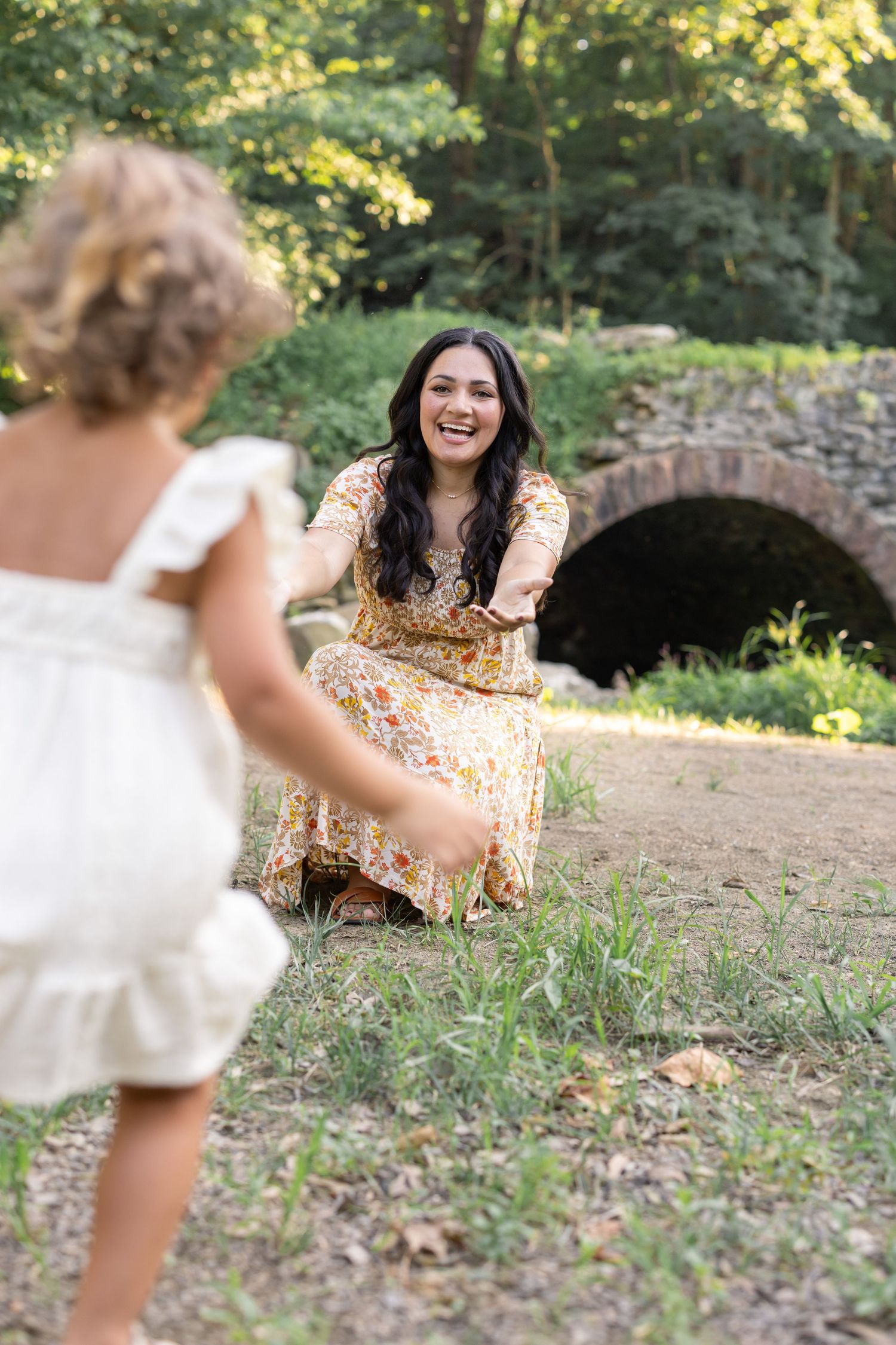
Patterns can also work beautifully when used intentionally. Soft florals, subtle prints, and understated designs can add personality and warmth to a session. The key is restraint and balance. Typically, one or two family members wearing gentle patterns is enough to create visual interest while the rest of the family supports the palette with solid tones.
Stripes and high-contrast patterns, however, can often become visually distracting in outdoor environments and may pull attention away from connection and expression. This is why it is important to think of clothing as part of the overall composition rather than isolated individual outfits.
For a deeper understanding of how certain wardrobe choices can unintentionally disrupt the final image, families can explore What not to wear for family photos: Common Style Mistakes, which breaks down common styling missteps and how to avoid them for a more cohesive result.
Matching Your Wardrobe to the Environment
One of the most important yet overlooked aspects of choosing the best colors for family portraits is how those colors interact with the environment. The surrounding landscape plays a major role in how clothing appears on camera, especially in outdoor sessions where natural light and organic backgrounds dominate the visual composition.
For example, lush green fields are one of the most popular backdrops in Lancaster, but wearing too much green in this setting can cause subjects to blend into the environment rather than stand out. Similarly, overly warm tones in a golden autumn field may become visually overwhelming if not balanced with softer neutrals or contrasting cool tones.
The goal is not to compete with the environment, but to complement it. Soft creams and neutrals tend to stand out beautifully against natural greens, while muted blues and blush tones add contrast without feeling harsh. In wooded or rustic settings, warm earth tones and layered neutrals often create a cohesive, organic feel that blends seamlessly with the surroundings.
Thinking of your wardrobe as part of a larger visual story helps shift the focus away from individual outfits and toward overall harmony. Each family member becomes part of a larger composition that includes light, landscape, and emotion working together in a unified way.
Designing Wardrobes with Home Display in Mind
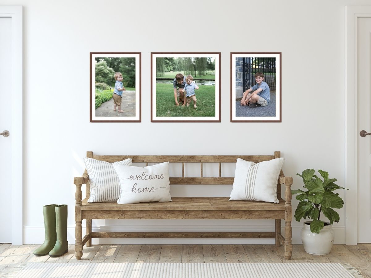
A powerful way to approach family portrait styling is to think beyond the session itself and consider how the images will live in your home. Family portraits are not just temporary digital files—they often become permanent visual elements within your living space, displayed as wall art, albums, or framed collections.
This is where intentional color coordination becomes even more important. The tones you choose should not only photograph well but should also complement your interior spaces. Soft neutrals and muted tones often integrate beautifully into a wide range of home aesthetics, from modern minimalism to warm traditional interiors.
When families think in terms of home design, they naturally begin to prioritize balance, cohesion, and timelessness. This approach helps avoid overly trendy color choices that may feel dated over time and instead encourages selections that will remain visually relevant for years to come.
The result is imagery that does not just document a moment but becomes part of your home’s visual identity.
Understanding What Works (and What to Avoid) for Different Family Needs
Every family brings a unique dynamic into a portrait session, and wardrobe choices can play a meaningful role in how comfortable and supported the experience feels. For families with additional considerations such as sensory sensitivities, mobility needs, or special accommodations, simplicity in color and fabric choice can help create a more relaxed and manageable experience.
Soft, breathable fabrics, familiar textures, and predictable color palettes can reduce visual and physical overstimulation, allowing family members to feel more at ease throughout the session. These thoughtful choices help ensure that everyone can participate comfortably while still achieving a beautiful and cohesive final gallery.
Some families may find it helpful to explore Family Photos with Special Needs Children: Creating a Comfortable Experience, which provides guidance on creating an inclusive and supportive environment during portrait sessions.
Ultimately, the best wardrobe choices are those that allow each family member to feel like themselves while still contributing to a unified visual story. Comfort, confidence, and cohesion always translate more powerfully in images than any specific trend or rule.
Reserve Your Family Portrait Session in Lancaster, PA
Choosing the best colors for family portraits is only one part of creating a meaningful and elevated photography experience. When combined with thoughtful planning, intentional styling, and a guided session approach, it becomes part of a larger process designed to preserve your family’s connection in a way that feels natural, timeless, and deeply personal.
Connect with me today as the first step toward creating a family portrait experience in Lancaster, PA that feels calm, intentional, and beautifully aligned with your family’s story. I’d love to understand your vision and answer any questions you may have. Together we’ll design a session that reflects your family in the most authentic and elevated way possible.